
Cold, Chic, and Designed to Perform
The visual history behind ski fashion, Alpine posters, après-ski atmosphere, and the branding that made winter culture irresistible.

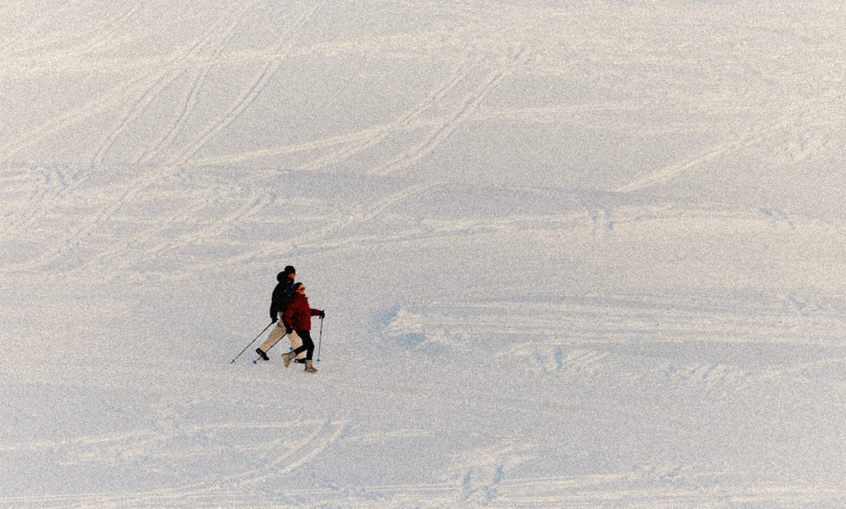
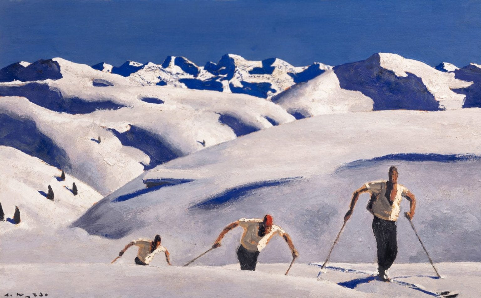
This winter marks my fifth season snowboarding. That sentence sounds far more athletic than I actually am. As a designer who spends most days indoors, hunched over a screen, I have never considered myself an outdoorsy person. I love the ritual of getting ready for the mountain, the gear, the graphics, the visual identity of the sport far more than I love the sport itself. The geometric patterns on jackets, the vintage posters on lodge walls, the glossy boards lined up against the snow. I notice everything. And the more time I spend on the mountain, the more I realize that ski culture has one of the richest visual histories of any sport.
Ski season is not just a seasonal pastime. It is a design ecosystem. A perfectly preserved world where fashion, industrial design, graphic design, architecture, color psychology, and cultural storytelling meet. It is a rare example of a sport where the visuals are not an afterthought. They are the product. They create the fantasy before anyone even steps onto a lift. So today, I want to explore the visual language of ski and snowboard culture and why it has shaped design for almost a century.
Keep reading with a 7-day free trial
Subscribe to Butter & Bagel to keep reading this post and get 7 days of free access to the full post archives.